01 — SPOSAI / LANDING PAGE
Designing the first impression of a complex wedding platform.
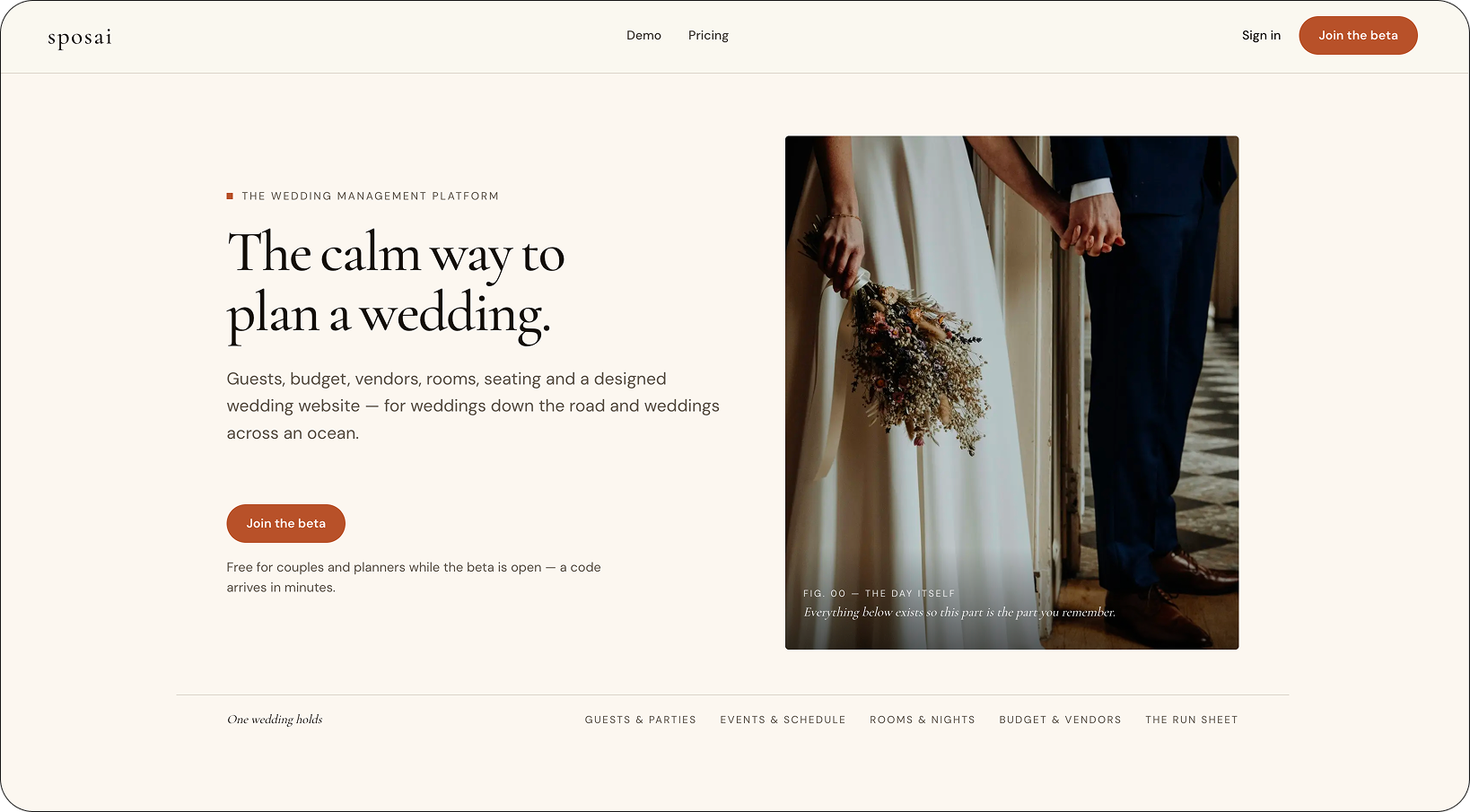
I designed Sposai’s landing experience to communicate a product that works on both sides of a wedding — a comprehensive planning workspace for couples and professionals, alongside a customizable, editorial guest-facing website.
02 — CONTEXT
One product. Two very different audiences.
The landing page needed to speak to two audiences with very different levels of familiarity: couples planning a wedding for the first time, and professionals with established ways of managing weddings. The challenge was making Sposai approachable to one without oversimplifying it for the other.
At the same time, the experience needed to communicate both sides of Sposai — the planning workspace and the guest-facing website — without turning the page into a long list of features.
Sposai landing page · Desktop
03 — INFORMATION HIERARCHY
Making complexity feel simple.
The challenge was communicating Sposai’s breadth without overwhelming a first-time visitor. I structured the landing page to reveal information progressively — establishing the core idea first, then introducing key capabilities through real product views before moving into more specific experiences.
This gave each section one clear job and allowed the product’s depth to emerge as the visitor moved through the page.
How the landing page unfolds
04 — PRODUCT MODEL
Turning two sides of the product into one clear idea.
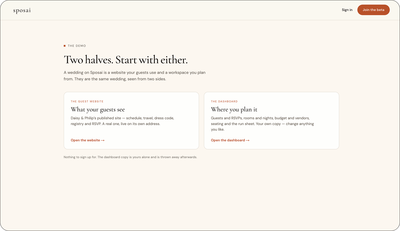
Sposai combines two very different experiences: a public website for guests and a private workspace for planning. Rather than explaining that relationship through a long list of features, I reduced it to a simple mental model — what your guests see and where you plan it.
Giving both sides equal weight made the relationship immediately visible while letting visitors choose which one they wanted to explore first.
Two entry points, presented side by side
05 — PRODUCT STORYTELLING
Making a complex product easy to explore.
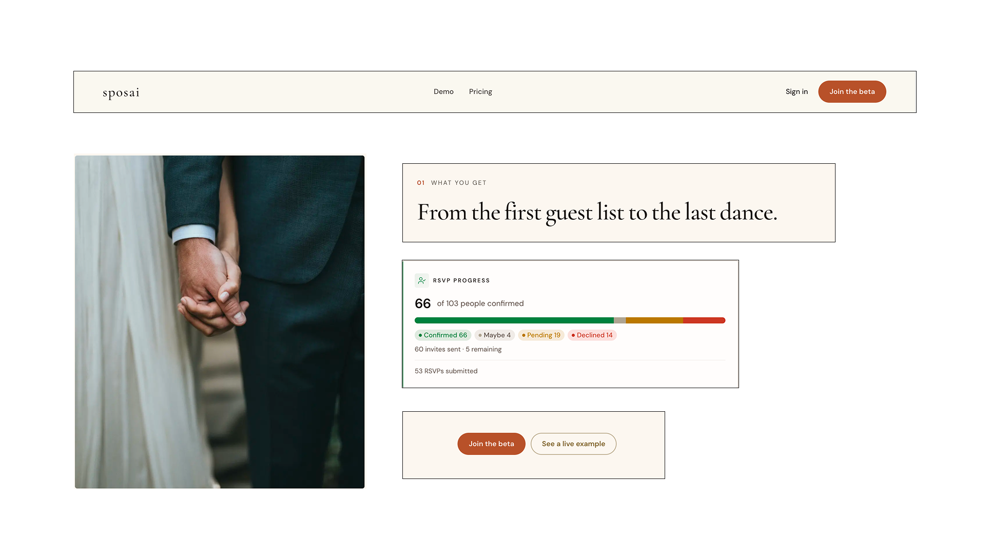
Sposai spans very different parts of wedding planning, from the guest website and RSVPs to accommodation, budgeting, day-of coordination, and assistance. I organized these capabilities into a guided sequence, pairing each one with a corresponding product view rather than presenting everything at once.
06 — VISUAL DIRECTION
Bringing an editorial sensibility to a planning product.
I wanted the landing page to feel closer to the world of weddings than to traditional planning software. I used restrained typography, warm neutrals, editorial imagery, and generous spacing to create a softer visual language without sacrificing the clarity the product needed.
The interface views remain structured and functional, while the surrounding art direction gives them room to feel considered and aspirational.
07 — RESPONSIVE EXPERIENCE
One experience, designed for every screen.
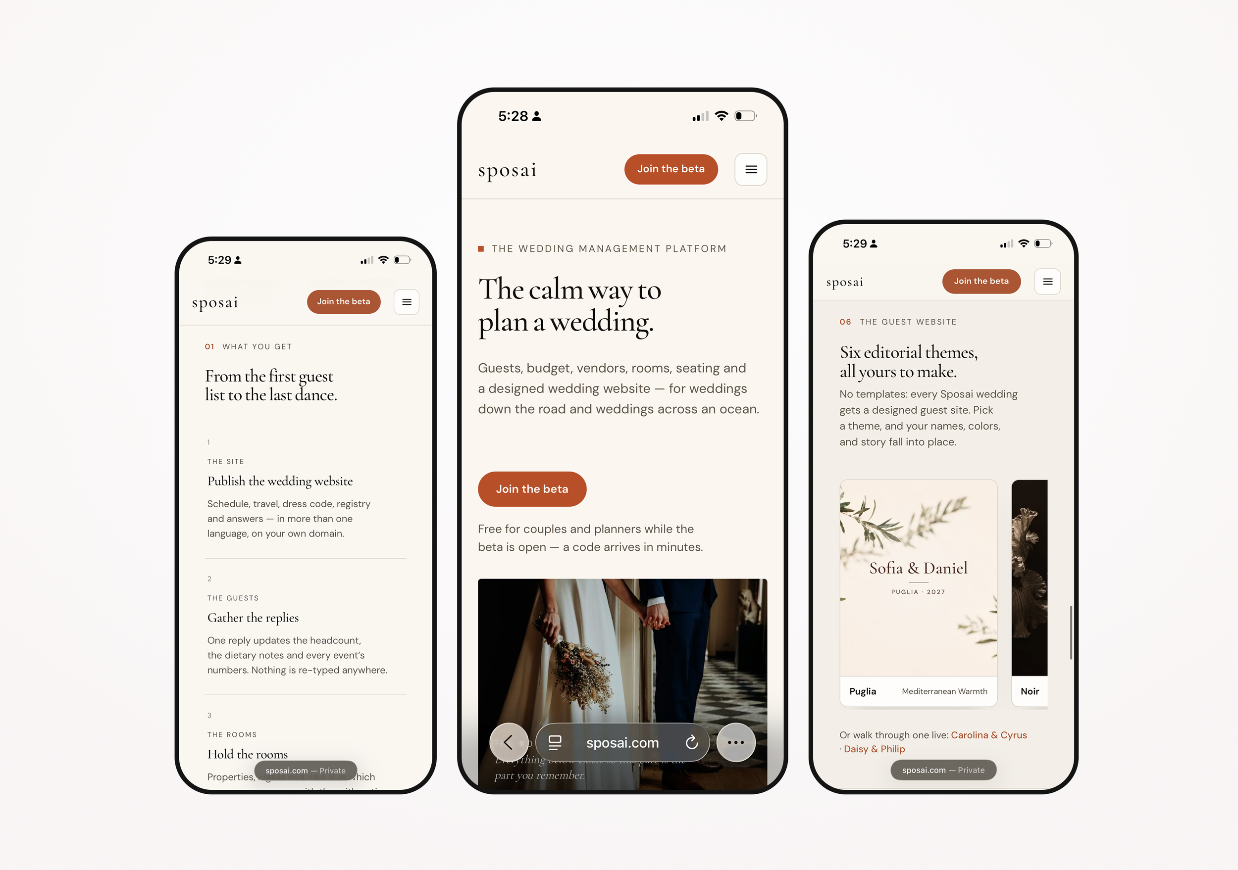
The mobile experience preserves the same hierarchy and visual language as desktop, while adapting how content is presented. Wide layouts become focused vertical flows, horizontal sequences are reorganized for scrolling, and navigation is simplified without losing the primary actions.
The goal was not to fit the desktop experience onto a smaller screen, but to preserve the same clarity and hierarchy as the layout changes.
08 — NEXT ITERATION
The next decisions will come from real use.
Sposai is entering beta with four couples who will use the product to plan their weddings. Their experience with the landing page and product will inform the next iteration, from what is immediately clear to where people hesitate, misunderstand, or need more guidance.
I’ll use those findings to identify what should change rather than adding complexity based on assumptions.