SPOSAI · 2026
I designed the guest experience for our own destination wedding.
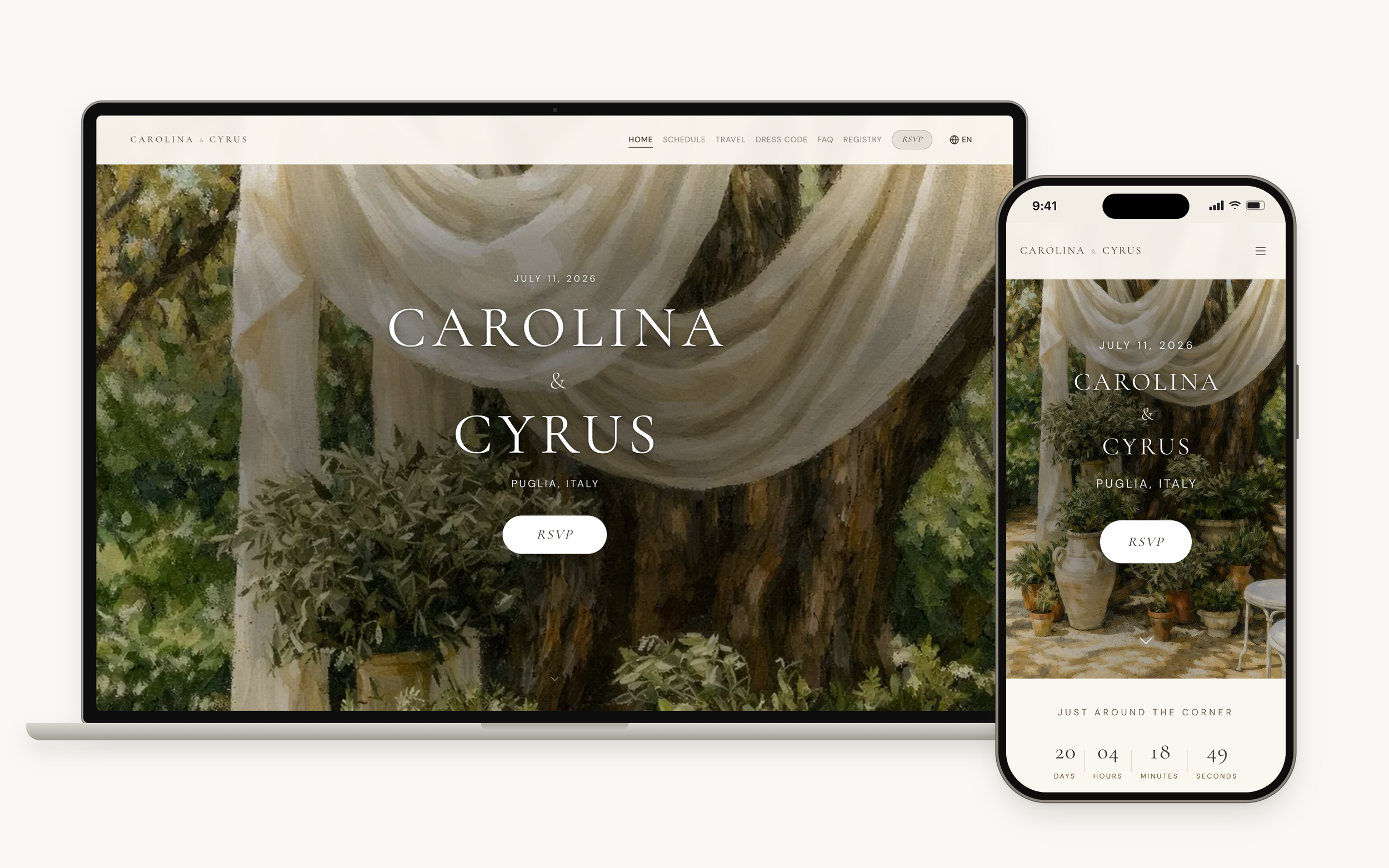
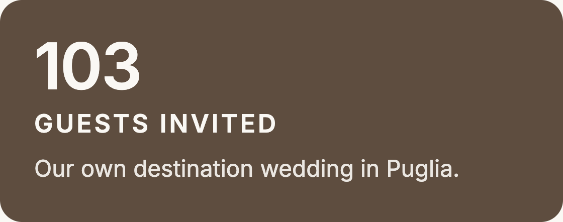
Every page our 103 guests saw, from the RSVP to the registry, designed and built by me.
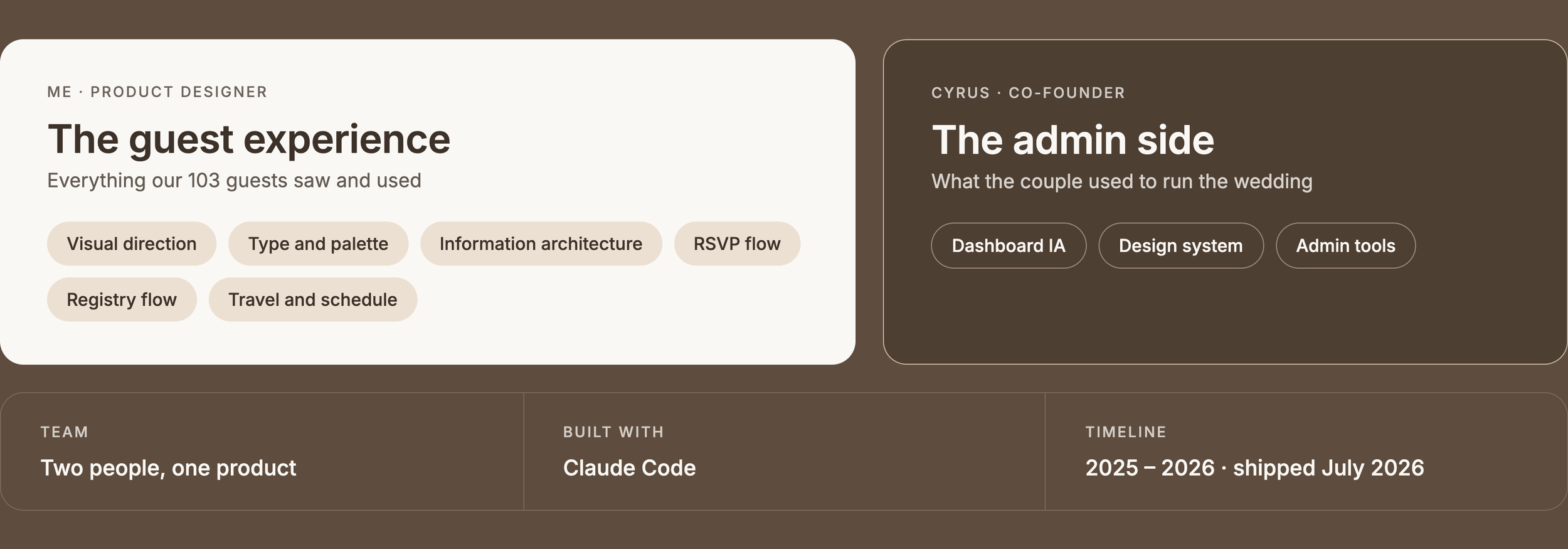
01 / MY ROLE
I owned everything our guests saw and interacted with.
02 / THE PROBLEM
Existing wedding tools managed the pieces but not the overall experience.
We reviewed the tools out there. Each one handled the admin side or the guest site, never both well.
03 / THE INSIGHT
Planning a wedding isn’t one workflow. It’s dozens happening all at once.
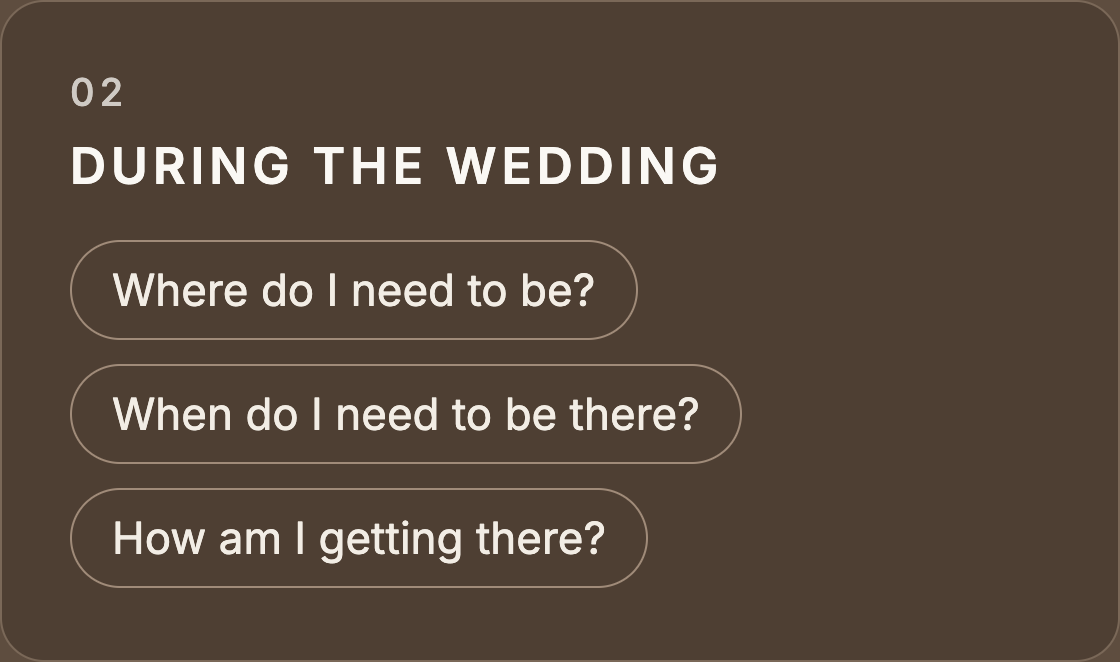
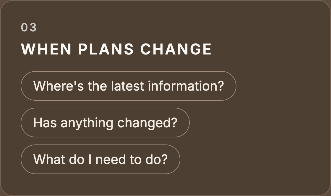
THE GOAL
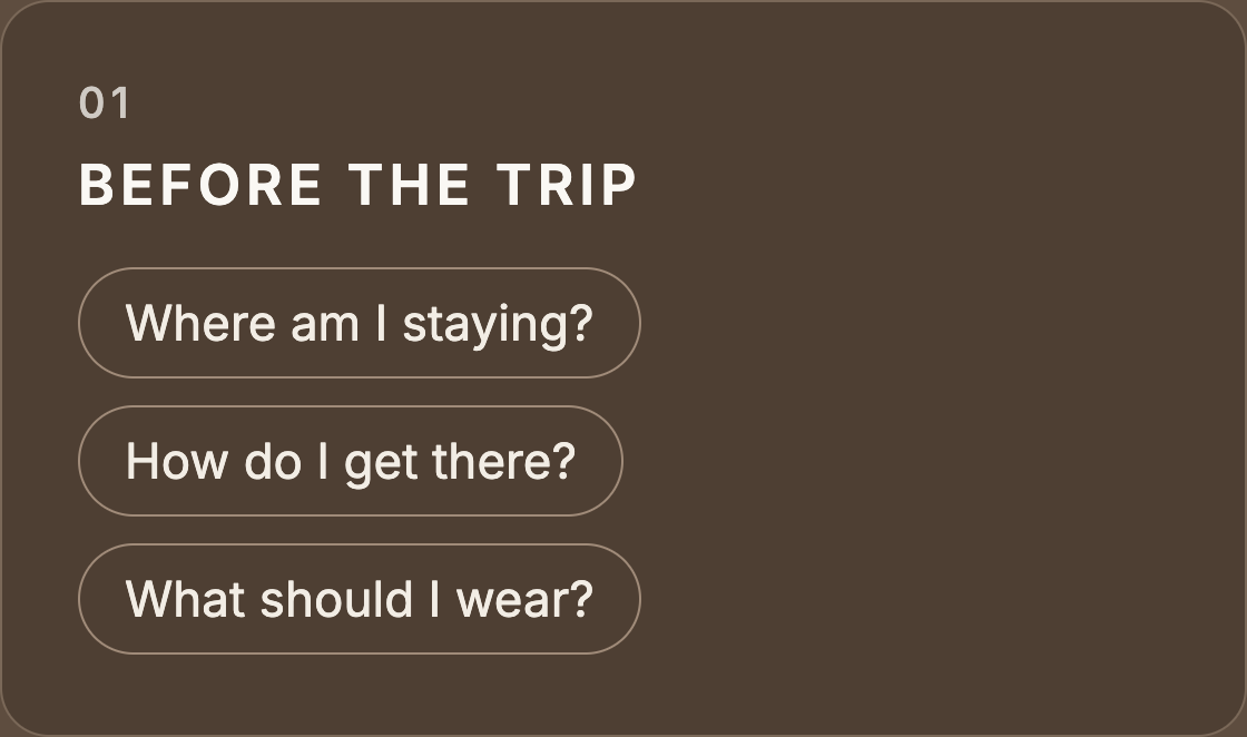
Guests always know what to expect, where to go and when to be there, without having to ask the couple.
04 / DESIGN DIRECTION
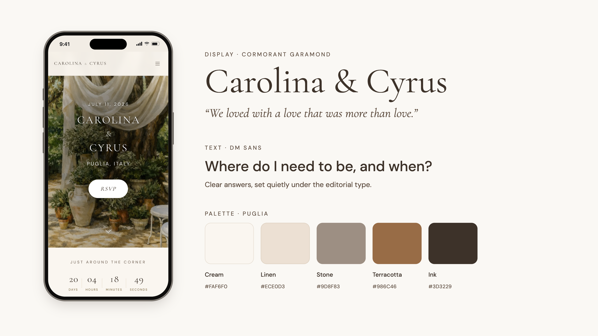
Our guests didn’t need the planning chaos. They needed to feel guided and cared for.
05 / THE RSVP
One RSVP for a three‑day weekend.
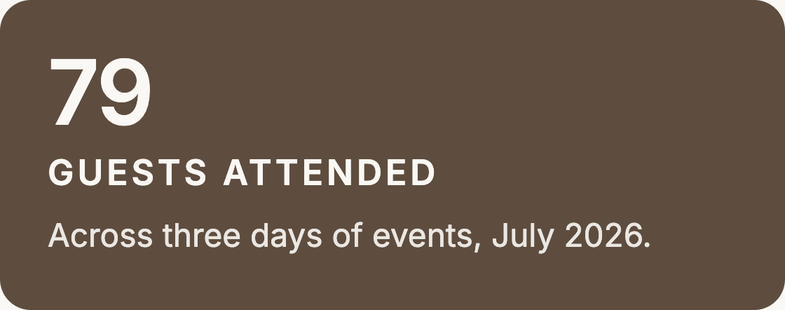
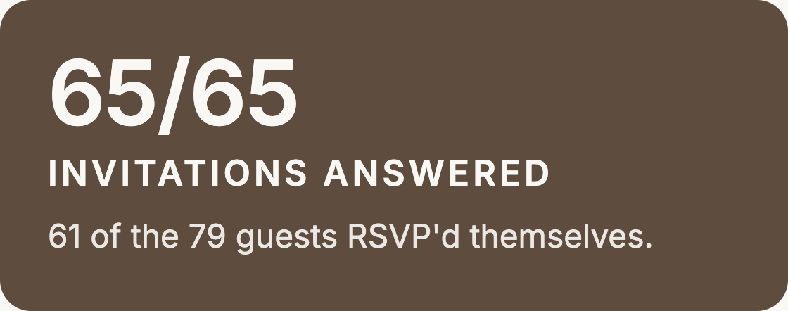
61 of the 79 guests who came RSVP’d here themselves. We recorded the rest for relatives without internet access.
01
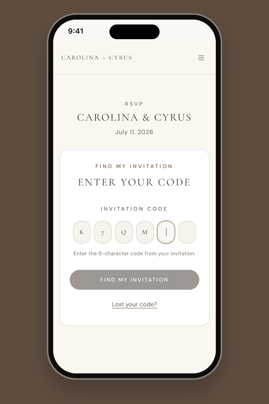
ONE CODE PER HOUSEHOLD
No account or password. The code on the invitation opens the whole family’s RSVP.
02
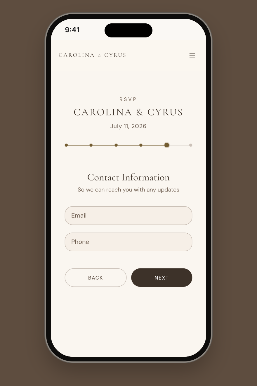
ONE QUESTION PER STEP
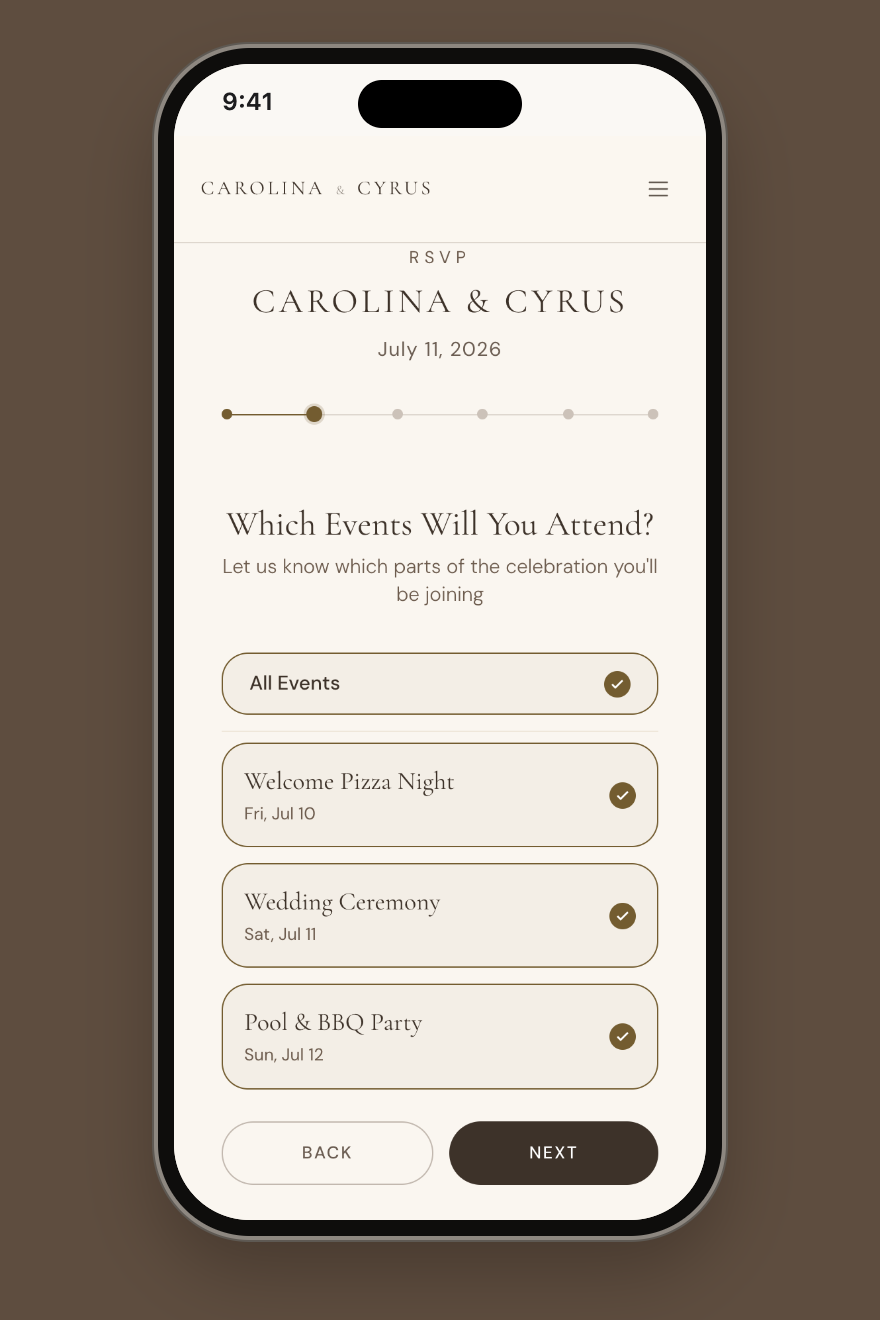
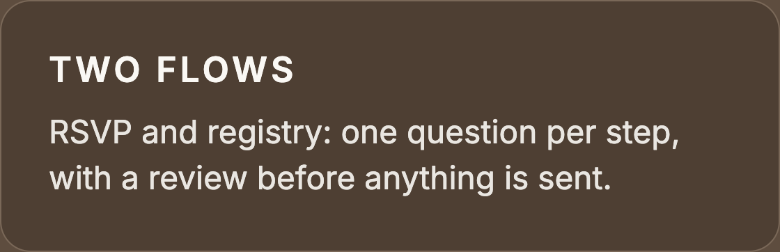
Events, guests, travel, then a review. Progress dots show how much is left.
03
ANSWER PER EVENT
Guests pick the events they’ll attend, so the couple gets a real headcount for each.
06 / THE REGISTRY
Giving a gift should feel as considered as the rest of the celebration.
Built into the wedding site, not a separate registry: amount, card, note, review, then a Stripe checkout.
07 / TRAVEL AND SCHEDULE
Making a three-day wedding easy to follow.
Day → Time → Event → Location → Essential details
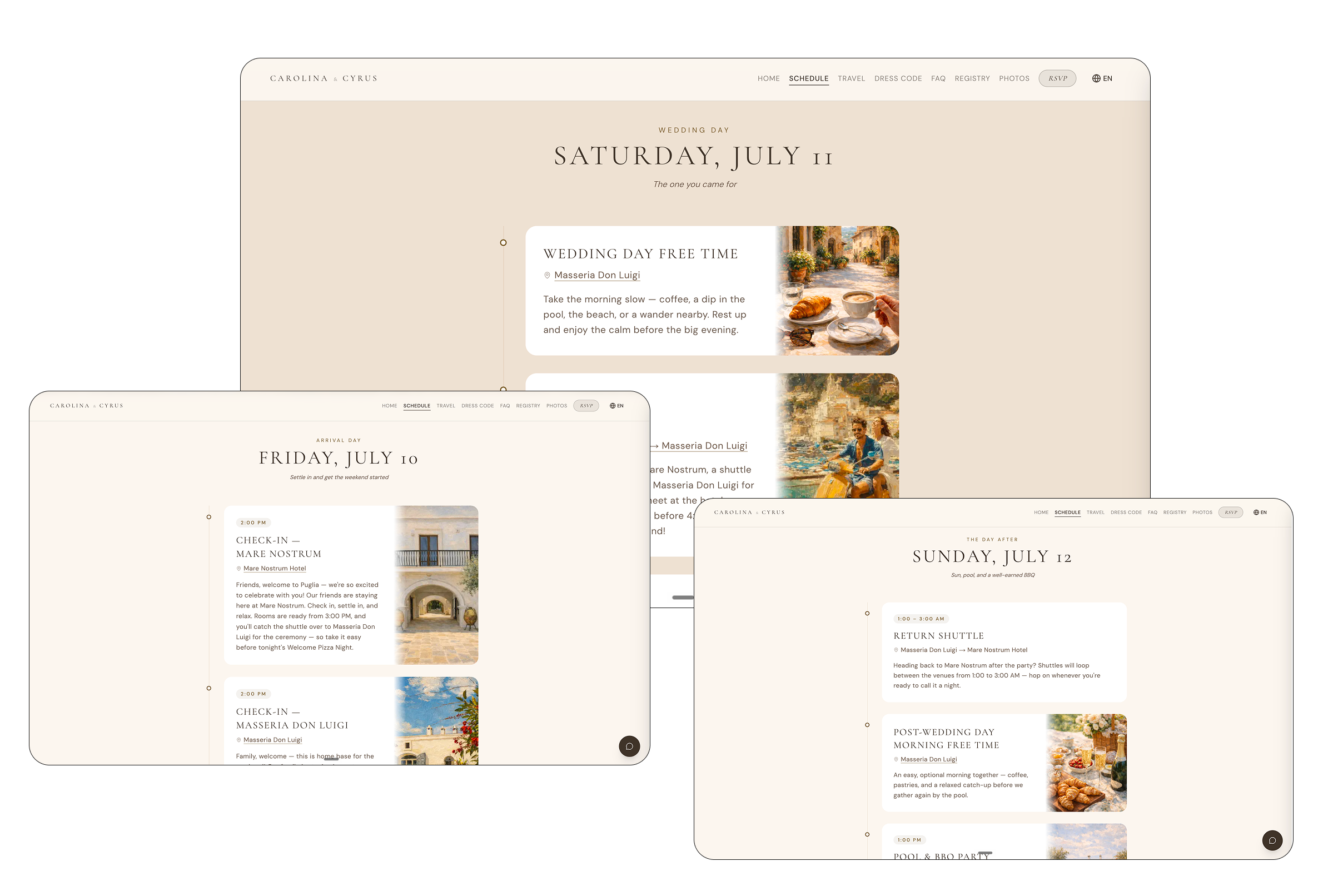
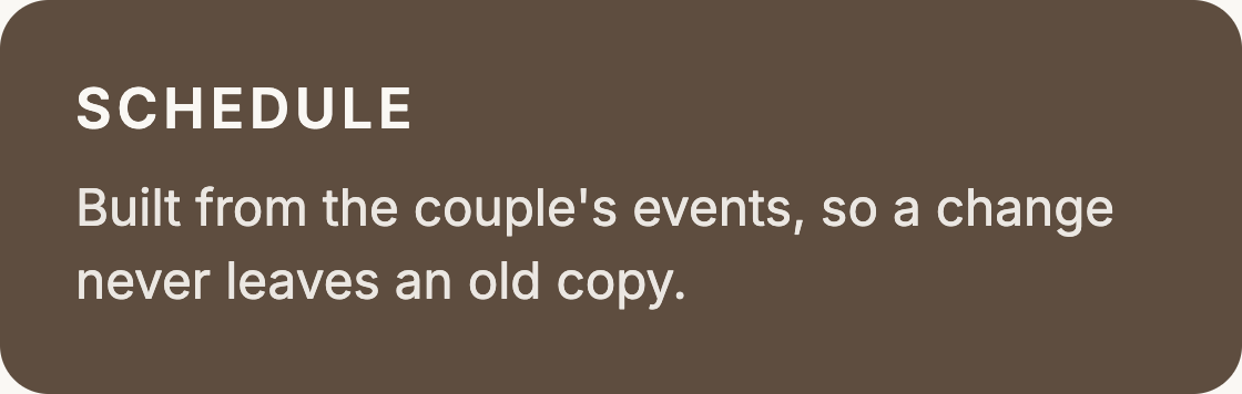
Shuttle times, rooms and events change right up to the wedding day. So I designed every guest card to read straight from the couple’s dashboard. When they move a shuttle, guests see the new time without anyone updating the site. I designed the guest side; Cyrus designed the dashboard.
I designed for plans that change.
08 / CONNECTED LOGISTICS
09 / HOW I BUILT IT
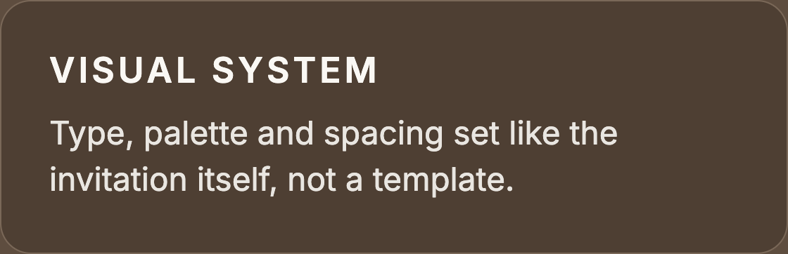
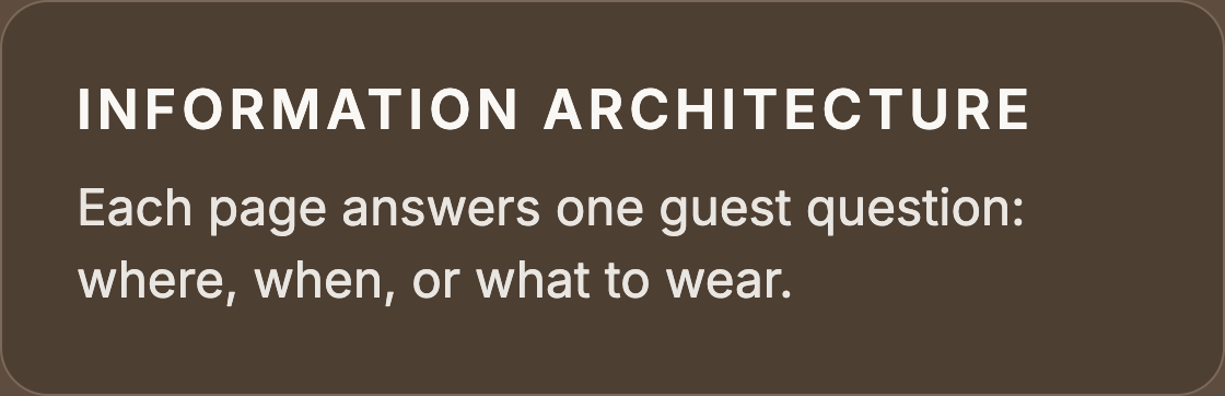
I designed and built the guest site with Claude Code.
10 / OUTCOME
From a personal planning problem to a product used in the real world.
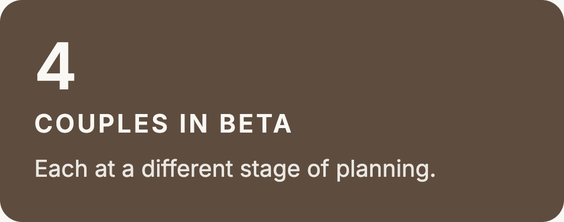
Sposai was built around our own destination wedding, giving us the opportunity to use the product end-to-end throughout a real three-day celebration, not a simulated scenario.
Our wedding · Puglia, Italy · July 2026
11 / REFLECTION
Designing beyond individual screens.
The biggest shift in my thinking was learning to design the connection between systems and experiences, not just the screens in between.
NEXT CASE STUDY — SPOSAI LANDING PAGE
I redesigned Sposai’s landing page around one promise and one action.
Six versions of the first screen in four weeks: how I cut the hero from five controls to one button and turned a features list into a running order.